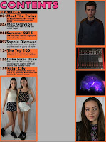
The first step I took was creating my background and cutting out photos for my contents page. I used various tools such as the magic wand tool and the magic eraser tool but found that the photos looked to unnatural for a contents page as a conventional aspect is to keep the backgrounds of your photos. I looked for inspiration from DJ Mag. I created a board around the photos to make them stand out. I used the shape tool to do this.
In the next stage I added more photos and started to create text for my page. I used the text tool to do this and chose to have the main title of the articles a different colour to the small amount of information given about each article. I used the slice tool to create well measured columns. I wanted to show a range of different shots in my contents page from a Long shot (the twins), a mid shot (Lewis), a medium close up (Olivia).


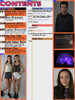
From evaluating my decisions made so far, I felt as though the colours of the features section was not working and was infact t to bright for text that someone would use for navigation and therefore I changed it to a plain black colour as it is easier to read. I then chose to change the colour of the background by using a brighter colour as I felt that the text would be easier to read this way.
Here I chose to have each 'topic' of the magazine as a different colour to again allow easier navigation. This meant I would also be able to use colour coded running heads to create a house style. I then added social media links at the bottom to avoid negative space and then to also show the links that magazine have with social media.


No comments:
Post a Comment