Thursday, 14 January 2016
Wednesday, 13 January 2016
Making My Double Page Spread
I began my double page by creating a grey background using the paint tool. I then used the layer tool to put my photo onto the page. I then used the magnetic lasso to cut out the photo. Next I added a black rectangle and the running head that was the same colour as the features column in the contents page. Using the same fonts as on the front cover I started on my headline and then changed my font to the artists 'logo'.
Next I added in a small horizontal photo and created a Standfirst to introduce the article, which wrapped around the photo. i then created my drop cap which was the same font as the 'logo' in the headline. I then used the grid tool to create columns to put my text in and wrapped my text around the drop cap, leaving space for the pull quote. In the text I used language that is suitable for my reader using swear words and slang. This would mean their is no barrier between the reader and the article as they will be able to understand it. The questions from the interviewer are in the same colour as the logo, drop cap and border of the photo to create that connection within the whole article.
I then added in the pull quote and wrapped the text around it. I created the pull quote in the same font as the logo etc. and used the stoke tool to but a black boarder on it like I have done with all the other parts. Next I added in another pull quote on the side I have my large photo on to get rid of negative space. I then added a small piece of text explaining the background information (byline), which is a conventional element used in dance music magazine articles. Page numbers were added which were inspired by the way Mixmag do it as I have put the name of the magazine and the page number together.
Making My Contents Page
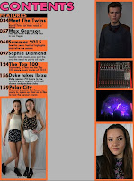
The first step I took was creating my background and cutting out photos for my contents page. I used various tools such as the magic wand tool and the magic eraser tool but found that the photos looked to unnatural for a contents page as a conventional aspect is to keep the backgrounds of your photos. I looked for inspiration from DJ Mag. I created a board around the photos to make them stand out. I used the shape tool to do this.
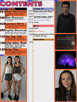
In the next stage I added more photos and started to create text for my page. I used the text tool to do this and chose to have the main title of the articles a different colour to the small amount of information given about each article. I used the slice tool to create well measured columns. I wanted to show a range of different shots in my contents page from a Long shot (the twins), a mid shot (Lewis), a medium close up (Olivia).


From evaluating my decisions made so far, I felt as though the colours of the features section was not working and was infact t to bright for text that someone would use for navigation and therefore I changed it to a plain black colour as it is easier to read. I then chose to change the colour of the background by using a brighter colour as I felt that the text would be easier to read this way.
Here I chose to have each 'topic' of the magazine as a different colour to again allow easier navigation. This meant I would also be able to use colour coded running heads to create a house style. I then added social media links at the bottom to avoid negative space and then to also show the links that magazine have with social media.
Monday, 11 January 2016
Creating My Front Cover
Here I used the Magic Wand tool and the magnetic lasso to cut out this photo.
I then added the photo onto a new layer and coloured the background with the paint bucket tool, using the eye dropper tool to get the colour of lilac in the cover stars top. I then cropped the photo using the free transform and crop tools as a close mid shot is a conventional shot to use for a feature article photo. Next I created a masthead and a puff. I used the stroke tool create the black border around the text to make it stand out.
Next using the text tool again, I created my cover line.
I then added the plugs using alternating colours. I made the decision to change the layout of the plugs and cover line to one of my other sketches I did as I thought the layout was more conventional. I think this new layout is more visually pleasing too.
I chose a darker background and bright colours. I used the pink in the cover stars top to make a connection between the colour scheme and the what she was wearing. The background and bright colours make the magazine look more like a magazine in the dance music genre. My survey said that my audience would want bright colours however I adapted the meaning of 'Bright Colours' from light tones to more luminous tones.
I chose a darker background and bright colours. I used the pink in the cover stars top to make a connection between the colour scheme and the what she was wearing. The background and bright colours make the magazine look more like a magazine in the dance music genre. My survey said that my audience would want bright colours however I adapted the meaning of 'Bright Colours' from light tones to more luminous tones.
In the final stages of creating my front cover, I added in more plugs and finished my 'stacked plugs' by using the free transform tool. I then added in a barcode at the bottom which I created on the internet.
Monday, 4 January 2016
Subscribe to:
Comments (Atom)


