Thursday, 3 December 2015

Contents Page and Double Page Spread Photo Shoots


In Lewis' photos, I wanted to create a mysterious persona for the 'DJ Lewis' would be in my magazine. I therefore tried a variation of layouts of my lighting equipment during the shoot as I wanted to have half of this face lit to create that mysterious tone. I though that creating this tone would create a perfect photo for a contents page as I felt that it would entice the reader to want to find out more about this DJ. I chose between the top left and top middle photos to use as I though that the lighting created the shadows I wanted. Here I shot mid shot photographs. I really love the top middle shot as it captures the correct tone and looks mysterious tone as well as having strong eye contact with the reader 


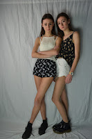
I feel that these were the photos that captured the correct representation from the artists I wanted each model to become. I used a 3 piece set up and changed the layout of the lights and took some away to really find the correct lighting.  With Harriet and Ellie, Wanted them to come across as fun, bubbly characters so I therefore made there face well lit and the background also well lit. I chose for them to have similar yet different outfits to show the difference in them which is shown in the language and text I plan to use in my double page spread.


Monday, 30 November 2015

Front Cover Shoot: 2


I chose to change my idea of having two cover stars on my front cover to only having one. This is because I felt that the more conventional dance music magazines only used one cover star and I then felt that I would be able to have a more conventional layout if I changed my ideas. I used Olivia as I wanted a cover star that would be able to pull of the 'dance music look' and I felt that she would be able to do this perfectly. I dressed her in a floral crop vest with a black background and brightly coloured detailing I which I used the most distinct colour of pink in my magazine colour scheme. she then wore black shorts and a black leather jacket to show to basic mainstream factor of dance music. These are typical pieces of clothing a dance music fan and a reader of Maxmag, DJ Mag, etc, would wear at festivals. I designed the character that I wanted Olivia to be; a dance music artist that is a singer. I fell like I brought this out in these photos as she is a normal person who enjoys dance music along with potential readers of my magazine.
 
I used the 3 piece lighting set up and a white background and had one light facing up from the ground directly on her face and another light on a stand, facing her directly too. I then had another light on the background. This allowed me to really brighten up her face and make her a more approachable character in the sense that she is well lit and therefore natural and less intimating than if I had litb the background with two lights and only using one light to on her face to create a shadow.


Friday, 27 November 2015

Photo Shoot - Front Cover


This shot was a mid shot that is conventional for a two person magazine. The lighting was low to allow a more mysterious tone to come from the artists. I thought that the positioning was good and therefore I chose to use this shot as my cover photo. However after many attempts at editing it, it was too poorly lit to be used as the reflections of light on the jackets found me in a difficult position as I could separate the background from the colours on the jacket. Also the model on the left had messy air and therefore it was difficult to make crop out the photo and allowing it to still look natural. However, from this I have learnt that I need to have a well lit photo where the models and take more care in choosing the material in which my models clothes is made from and also I need to look at the state in which my models hair is in.


This shot is lit from the right-side and  bottom soft boxes. This photo is well lit however the positioning of the 'hand over the shoulder' doesn't work as when the photo is cropped the hand will make the shot unconventional.


This shot is light from both the right side above the model, the left side and also from the bottom soft boxes. Again the positioning of the models hand over the shoulder caused the same problem.


 Although well lit, the image connotes the wrong impression I wanted from these 'artists' as one on them is smiling and the other had a more serious face. The denotation meant that I could use this as it would give the wrong impression I wanted.


I really liked this shot but maybe for a double page spread or contents page as the models position is unconventional for a front cover. The jackets were too lit up and would have made the colour stray from my colour scheme of bright/ luminous colours and would change it to light colours which would've conveyed the wrong genre of magazine for example Pop.


This shot is a well lit shot, however the model on the right, has her head low down and therefore would leave either negative  space or, if filled, a unconventional feature between the picture and the top of the magazine.


From doing this shoot I have learnt a lot of things that I need to change and I have made decisions  based upon what I have learnt. One thing is that I fell like it is difficult to get the positioning of two cover stars perfect and therefore I have changed my mind and have chosen to take new photos using only one cover star, despite what my survey says. this will allow a more intimate connection between the artist and reader.  I have also looked at the costumes in more detail and I will chose dark clothing against a white background. I will also do research into positions I  would like my new cover star to do as I feel that I need to be more cautious about every aspect of the photo.  


Thursday, 26 November 2015

Sketches and Desgins


 These are my designs for my front cover, contents page and double page spread. I have chosen to create designs for a single cover star as from my research and personal opinion I have found that there is so profound suggestion for the amount of cover stars as my results were balanced and also in case the layout does not work. I have used my design brief to guide me when creating these designs making sure I have included all the convectional elements I want to use.


Design Brief


My Design Brief

My project brief is to create a magazine product including a front cover, contents page and a double page spread while sticking to conventions of the music genre I have chosen.
From my survey analysis and my competitor magazine analysis I have created a design brief to guide me in the right direction when creating my product.
  • My magazine should be a fun product that gives a friendly and informative mode of address to express the dance music genre.
  • I need to use bright colours to represent the music genre and to appeal to the target audience.
  • Include a variety of topics and section in my contents page.
  • I need to use a variety of upper and lower case text in my magazine product
  • I would like to use two cover stars using a mid shot , however if the layout does not work I will only use 1 cover star using a mid close up shot.
  • I need a balance between the text and pictures on my contents page as my target audience are pleased with more visual products (Mixmag and DJ)
  • I need to do an interview for my double page spread.

What I Have Learnt and What I Am Going To Do


Audience Profile


Audience Profile-

Gender: Female (even though the genre is equally for men and women)
Age: 16-25
Social Class: Skilled Working Class (Because they would need to be able to fund the type of lifestyle for the typical Dance music lovers of going to club nights as well as festivals, however due to the young age group I am going for, I feel as though the best social class to aim for is this category as these people will just be starting work, going to University and starting to get a reasonable wage. Therefore they are able to fund the lifestyle to a certain extent and have a high disposable income.)
Income: Medium(Most of which is disposable income for the lifestyle)  
Ethnicity: White (the vast majority of dance music followers have a white ethnicity)

Fashion: A mix of both dark and bright colours for both club nights and festivals. Festival wear seems to have more patterns and colours, however club night outfits seem to stick to basic colours with their outfits. 
Personality: The target demographic is outgoing and always 'up for a good time' and enjoy the company of others.


Tuesday, 10 November 2015

Survey Analysis


Members of my target demographic of 16-25 year olds from both genders participated my survey which I made to research what should be included in my music magazine and to look at initial ideas for my design and content.

I have chosen to have fun attitude and friendly yet informative mode of address. The magazine will have a bright colour scheme full of luminous colours to represent the lighting used in night clubs where the genre of dance music is played. This will be used on the front cover for the masthead, cover line, the puff and the plugs. The plugs will include advertisements to certain article of interviews, information on artist, album reviews and event reviews. I would like to use the name "CC" for my magazine and position this in the top left hand corner, however if the layout does not work I will used the 2nd most popular name "Culture" using a thick font and both upper and lower case latter in the two names. I have also decided to use two cover stars on my front cover for my feature article photo which will captured as a mailshot. In the contents page I will use a 1:2 photo: text ratio. The double page spread with use lots of photos and will be an interview with the cover stars, (using pull quotes, a drop cap, stand first etc.)

Wednesday, 21 October 2015

DJ Double Page Spread Analysis


Competitor Magazine Evaluation
 
Double Page Spread 


This double page spread is conventional for the type of genre of Dance and Club Music.
The second part of the headline is bold and clear against the white background. This creates a bold statement for the article, making the reader want to look at it. The headline consists of two different fonts and colours creating a contrast which not only expresses the key information of the headline but connotes a contrast in the genre again. The words chosen in the headline do not make complete sense to any reader therefore intrigue the reader to find out more.

The stand first in this double page spread is quite long, however it offers a full brief into what is in the article.  The mix of short and long sentences allow textures within the this piece of text to again make the read more interesting too the reader. The byline creates a connection between the writer and reader to make the article more personal.

A drop cap is used to lead the reader into the article and is conventional in most magazines and other journalistic texts. The drop cap allows the reader to know if they are getting a professional story from the magazine.
 

When reading the article I felt as though I was reading a piece of persuasive in the way that once reading it, I felt as though I want to have the same experience. The demographic audience are young people with a club lifestyle who like to party and this article allows them to find out about the next experience they can have.  I enjoyed reading the article as the langue used is exciting and fun which reflects the music genre. “The plush party destination” would be a typical example of the language persuades the reader with this exciting language.


The mode of address in this article is very personal and connects to the reader in a way that is different to any other informative article. This article tells a personal story of the writers experience as the approach is friendly. The article doesn’t use a lot of jargon which makes the article less technical and allows a more pleasant read.
So this tells us the reader is likely to be a person wanting to be part of this experience therefore the article  allows an insight to this certain experience to entice the audience to become part of it. 
 
The use of a lot of pictures in this article is a little unconventional however is conventional for the demographic audience of young people who would have visually see what they are reading. The use of bright colours and people smiling entices the reader as It lights up the page, brings it to life and also sets a fun tone.

The photos on this double page spread are positioned like the contents page as both pages use the small write gaps in-between photos to make them easier to look at and to make them stand out more.